Build Inc. has filed their new designs for a proposed 435-foot-tall residential tower to rise on the northwest corner of Market Street and Van Ness Avenue, a prominent development previously dubbed “One Van Ness” but now known as One Oak.
While Snøhetta grabbed headlines for having replaced Richard Meier & Partners as the architects of note for the development a few months ago, the new design for the tower has been driven by SCB with Snøhetta focusing on the design of the proposed plaza below.
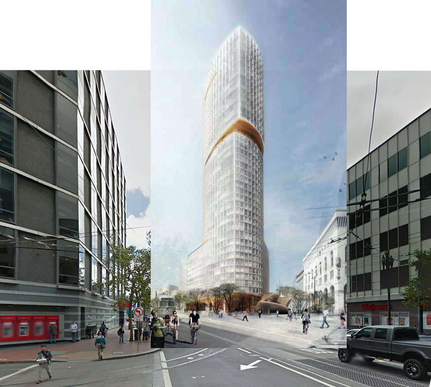
From John King with respect to the new designs for the development, the Meier design for which was plagued by projected high winds at the base of building:
The 37-story high-rise would be clad in masonry and glass, with three wedge-shaped cuts in the facade that could lessen windy downdrafts while creating lounges for residents of the 308 proposed units. But the public at large could enjoy the changes on Oak Street along the north edge of the property, where a portion of the block would be closed to create a landscaped plaza sheltered in part by perforated canopies 20 to 30 feet high.
And once again, the development team would like to move and rebuild the existing Muni subway stop on the west side of Van Ness from Market to Oak, on the north side of the project site, as part of the project as well.
Are they referring to the station entrance or the actual alignment of the tracks?
Station entrance.
A much better location for serving (recently “nice”) Hayes Valley area.
Heavens!!! Realigning the tracks (currently a pretty “straight shot” under Mkt. St. from Civic Ctr. Stn. towards Church St. Stn. and beyond), just in order to bow them out under this new tower and plaza, would be a BILLION-DOLLAR non-starter (not to mention degrading service through the no-longer-straight alignment, as well as shutting the whole system down for extended periods of construction)! No one in their right mind is talking about that. (Park Merced and the M-line are another story, but very different scenario.)
I’m sure they mean a new plaza entrance into the existing stn., either replacing the rather grody entrance on the NW corner or supplementing it with another access point.
I think it means rebuilding the station entrance. I can’t believe someone will mess around the tracks and the platform. The description seems misleading it should be clarified.
A modern masonry tower could be a cool approach, especially in the context of that area. It will be interesting to see how this design evolves.
I like it!
Love it. Very understated, but a beautiful and simple modern design. It is fresh. Have not seen it before and it does not try too hard. Finally some nice architecture. Nice it is not all glass.
Love it. Definitely a nice change of pace from what is usually built. Now to get rid of the two 1970s/80s buildings on either side of the image.
I believe the city is in the process of selling 30 Van Ness (building on right side of image)
[Editor’s Note: Another Mid-Market Tower Site About To Hit The Market.]
Agreed. Or maybe they could reskin those buildings.
Who is the developer on this? Wasn’t this a former David Choo site?
Does this project’s podium include 1540 Market? Also, remember that Handel has something in store for 1546-1564 Market Street.
I like the design but I believe they should do something more extravagant. This is a prime location for a signature tower since it’s a gateway to downtown.
What is “more extravagant”? Are buildings supposed to be defined that way? Doesn’t that come across as very arrogant?
What exactly is a signature tower? Who defines it that way? where should it be located?
“Doesn’t that kind of come across as very arrogant?”
Kind of like saying “Don’t listen to the people.”
Actually no. By that, I mean architects don’t “listen to the people”, meaning the average man on the street when it comes to complex design solutions required for an urban high rise tower in a prominent location. The man on the street will always have opinions about design, but opinions are not solutions.
What the architects have to listen to and will are: The client, the clients program, the budget, the time frame, the engineering and soils issues, the building and planning codes, existing urban infrastructure and context.
All those factors drive the ultimate built design solution.
I think the massing/height of this and all the other future towers in the area will definitely emphasize the “gateway” nature of the intersection/area.
Has potential
Like the bowed shape
Kill the wedge
Set above-wedge section off a few more degrees.
Have no idea what’s going on at street level but if street closure from Market to Franklin is happening I’m liking even more.
I think the wedge is a necessary design element for the protection against downdrafts (at least according to the article), and as such there’d have to be a different solution, right?
Should be taller /s
Where is All Star Cafe? Is it finally swallowed by the tower?
[Editor’s Note: All Star Cafe Doomed, New Architect For Prominent 400-Foot Tower.]
Please leave it to the architects to design and make all the decisions.
Don’t listen to the people.
Yes, please do Mr. Kitchen remodeler.
Agreed. And certainly not to the cranky old farts in this forum. Nothing would EVER get designed and built.
I prefer the previous version. And why does the donut shop have to close now? They’re no where near starting construction prep, are they?
Yup. Going to turn into a derelict property if appropriate vigilance isn’t paid.
“Going to turn into a MORE derelict property if appropriate vigilance isn’t paid.” FTFY.
The proximity of the tower to the beautiful 1911 Beaux Arts building has not been considered in this design. The tower’s height is not appropriate when it is directly adjacent.
Are you worried the 1911 building will develop an inferiority complex? Or will be damned to eternal shadows? How exactly will the increased height of this building (or the walgreens building directly across the street, or the honda building) detract from the Beaux Arts building? You probably should have spoken up about this when the height limits were being determined for these parcels.
Yes, you think people would learn from Manhattan, where no one wants to live or do business, because of the way towers are adjacent to older buildings. Clearly that’s been tried and failed there, why would someone want to repeat that mistake here?
/s
Condos or apartments?
Anything to block out Fox Plaza.
I think it is simply elegant. Good job Snøhetta. I do think an American architect could have been up to the challenge though. Shouldn’t have had to go to Norway.