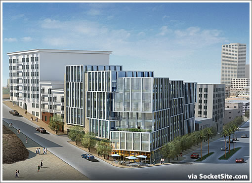
A plugged-in tipster reports with respect to the proposed development at 1960-1998 Market Street which was unanimously approved by the Planning Commission last night:
The following describes the design changes that were have made to the project over the last several weeks in response to the comments that were received from the Planning Commission, SF Planning Department and the Duboce Triangle Neighborhood Association.
Bernardo Fort-Brescia and the team at Arquitectonica amazingly improved upon their original design while going through what almost turned into design by committee. These Architects were challenged to respond to community and incorporate changes while still maintaining the integrity of the building, which is a bold, iconic statement for such a prominent comer location.
Market Street: Additional vertical fins have been added to strengthen the vertical expression. The major horizontal mullions have been reconfigured in a staggered pattern, eliminating their alignment and further reducing the horizontal emphasis of the façade. A canopy has been introduced along Market Street to reinforce the pedestrian and retail environment.
Buchanan Street: The changes described above have been incorporated into the first bay along Buchanan Street. The second bay has been modified significantly, stepping up in height to relate to the change in street level. The vocabulary of the second bay now relates to the adjacent residential buildings by incorporating stone and a more regularized window arrangement.
Light well: A light well has been incorporated at the northwest corner of the building that corresponds to the neighbor’s exiting light well.
Rear yard setback: The northeast corner of the building has been pulled back to allow a greater separation between this building and the neighbors to the north.
Another tipster adds, “In a topsy-turvy hearing, the local neighbor associations supported the project, while the Building and Construction Trades Council was opposed to it.”
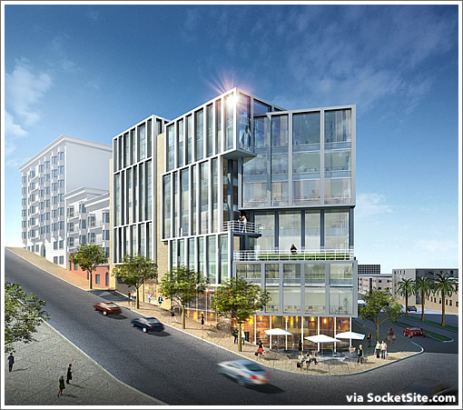
UPDATE: A close-up on the corner (and how it looked before):
∙ Now THAT’s Not The Arquitectonica Design For Market At Buchanan [SocketSite]
∙ Now THAT’s The (An) Arquitectonica Design For Market At Buchanan [SocketSite]
Those who predicted bay windows as a result of the neighbors’ involvement in the design were wrong.
How did this ALMOST turn into design by committee?
This was pure unadulterated San Francisco design by NIMBY action committee.
Looks like the building made it out ok. How much money had to be spent to go back to the drawing board? How much in delays?
No worries, the people who purchase these condos will pay for it. Thanks neighbors!
That stucco added on Buchanan is not an improvement. Blandifying that end “to relate to the adjacent residential buildings” is a loss.
I really like this building. I hope it gets built in its current incarnation.
Wow,
Exciting, no stucco on the building that is actually limestone. Really liked the design in the beginning but have to admit that the project seems to have had input from the community and planning instead of that making another bad building the process helped make a better building.
Hope for design in SF
Delancey – It’s not stucco, it’s stone. It seems the intent is to relate with the Mint building. Is it unnecessary or too formal? Perhaps, but stone accents on a metal sure look great together .
I liked it before but this is not bad at all. Certainly a glimmer of hope for our future urban landscape.
I’ll believe it after its passed the Board of Supervisors….and potential appeals.
I actually like the Market side better now. I’m not so sure about the stone though, will have to wait and see.
Building still looks great. The stepping down Buchanan and Market works. The Building Trades Council made fools of themselves and were reprimanded from Commission President Miguel for using the Planning Commission as their bully pulpit for labor contracts. Carpenters showed up in large numbers and were strongly in favor? Quite a scene.
I’ll believe it after its passed the Board of Supervisors….and potential appeals.
Why does it need to go to the BOS? It’s my understanding that it doesn’t need to.
There is very little in this burb that doesnt need approval from the BOS.
The BOS is our actual planning commission.
^So do you have reason to believe that this needs to go to them? Or are you just speculating?
I’m convinced that an optometry lobby group paid an architect to design the building to increase their business. They wanted the building to be blindingly reflective causing many’s eyesight to go bad and needing glasses.
Blandifying that end “to relate to the adjacent residential buildings” is a loss.
So is the stepping down the hill instead of a bold prow. One wonders why this new building has to step when the hulk at the top of the hill doesn’t.
The primary casualty of the restructuring seems to be floor height. I really hope they didn’t squish them all. It sure looks like the retail floor suffered… just what we need, more sad, cavelike store spaces with low ceilings. Whoopee!
Sometimes I think we should just face reality and convert the “planning department” into an architectural consulting firm and let them do the initial designs. Would save an awful lot of money…
P.S. The one thing I do like is the change into a more boxy window configuration on the Market building. Never been a fan of the narrow window. On the other hand, it wasn’t my building and it wasn’t my money, so who should care what I think about something like that?
I thought that any construction over 40 feet tall needed conditional use – and therefore BOS approval – even if the lot is zoned taller than 40′
^No.
If you look at the drawings carefully, the building actually got taller. In a way, it is stepping up instead of stepping down.
The height of the building didn’t really change, just the height of the glass and metal treatment on the façade. Stepping with the hill is a requirement of the Market and Octavia Fundamental Design Principles, with which the earlier versions of the design did not comply.
A secondary advantage of the stepping is that it now hides the elevator penthouse and other roof hardware.
There’s no automatic hearing at the Board of Supes, but neighbors or others may appeal the approval or request a design review, so it’s quite possible it will end up there.
The issue of parking was essentially tabled – the developer wants .63 spaces/unit but the approval was for .5, with all sides agreeing that the developer may come back later and ask for conditional use for the .63. I think they’re going to see what happens with other project approvals and parking before deciding what to do.
There are also 6 carshare spots to be provided.
This was not an example of NIMBYism and all sides, including the developer and architect, believe that the community process yielded a better design than was originally proposed.
“The major horizontal mullions have been reconfigured in a staggered pattern, eliminating their alignment and further reducing the horizontal emphasis of the façade.”
I actually liked the horizontal emphasis on Market. I’ve commented on one or two other projects that I like this height for the Market St. corridor and wish that Market was lined with similarly-heighted (you know what I mean) projects.
I feel there should horizontal emphasis.. and energy. I think of it as a “whoosh” along the Market corridor, connecting (in a way) Twin Peaks with the Ferry Building.
Another way to think of it… When I think of tall buildings I think of “standalone” buildings, with a plaza, i.e TransAmerica, BofA (555 Cal), 101 Cal, etc. (though I know that’s not strictly the case). Your eye is drawn upward.
With the Market St. corridor I think of this height of buildings, and the emphasis is not on the verticalness of the building, but on the flatness of the buildings, next to each other and closer to the street and community. The movement is along the street level (well, within the height of the buildings). The movement isn’t upward.
At least that’s my view- and since we’re talking about opinions, no one’s opinion is wrong.
“At least that’s my view- and since we’re talking about opinions, no one’s opinion is wrong.”
I feel we should invade Mexico, at least that’s my opinion, and since we’re talking about opinions, no one’s opinion is wrong.
“At least that’s my view- and since we’re talking about opinions, no one’s opinion is wrong.”
actually, the issue of “vertical” v. “horizontal” was resolved in the Market-Octavia Plan design guidelines which specifically call for vertical articulation. It was the result of a nearly 10-year planning process. Strangely, the Planning Dept was poised to ignore the guidelines it had itself promulgated.
I can’t understand why people are carping about the process. It looks like the developer basically got what he wanted and just had to make a few modest changes to address neighbors’ concerns. As a result it seems unlikely that anybody will bother to appeal this to the BOS and several months will be saved. Compared to the typical dysfunctional SF Planning process, this was a thing of art.
i prefer the original design with more metal work…this version looks cheap
The designers of this project obviously considered the neighborhood and the overall design when they created this project. These people are artists in a way, having a layman neighborhood resident being able to alter these types of project is pretty annoying. Comparing the two designs, the first was obviously the more detailed and interesting. It had the quality of really cool stacked boxes. It went together very well and. I find this new version to be quite vanilla and less elegant – nothing too different from some corner loft projects in Potrero Hill. You can see how compromising small things like the metal framework and incorporating stone can change so much. I know its a huge improvement for the lot…but I rather have the best product building that is more like a work of art in my neighborhood over something trying to fit that wont. Just upset at another missed opportunity for some special architecture….
I live next to the new development and virtually across from the recycling center. I have been jumped and beaten and robbed at my door step and my apt has been robbed. I’m sure the people buying the million dollar condos don’t want to live next to the recycling center and maybe the housing projects which aren’t too far away. Maybe this development will clean up the area including the homeless that hang out at Safeway and Starbucks all day. Maybe it will clean up the crazy drunks who come out of the Mint bar at 2AM, and maybe it will stop the the needle exchange in the Duboce Alley on Tuesdays, and maybe it will stop the homeless from jumping people across the street at the HR block parking lot, Maybe it will clean up everything in the neighborhood once rich people move in.