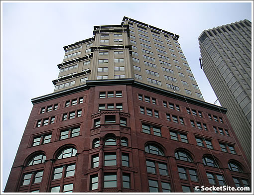
“As long as you don’t look up, the restoration of San Francisco’s de Young Building is the architectural feel-good story of the year.
Eleven stories of ruddy sandstone and brick command the corner of Kearny and Market streets every bit as robustly as they did in 1890, when the building that then housed The Chronicle opened as the tallest tower on the West Coast. You’d never guess that for 40 years the walls were hidden behind drab metal panels with a pseudo-modern look.
Unfortunately, the story doesn’t end with a dowager’s face-lift. To finance the rebirth, city officials let the developer put a tower in back. And that addition is so uninspired it almost undoes the good work below.”
does anyone have any pics of the before stage of the current project. That area is really a mess and hardly a lux place to live relative to some of the other ritz residences around the world.
I completely agree with King’s point about the mediocrity of the contemporary tower. Yes, I know that historic presevation requires that new additions not be slavish imitations of historic structures. But come on, now, surely they could have done better.
But that said, the restored Chronicle building is a real gift to the street, and an immeasurable improvement over the bland, aluminum-cladded facade it had before the restoration. No doubt this project will add life to previously run-down, neglected intersection.
I can’t say that I like the new addition on top but I don’t dislike it. I think it makes the older part really stand out and doesn’t compete with it at all. I think that was the intent and I think they succeeded. But, I know I’m probably in the minority with my opinion.
I have to look out my window at this rubbish every day…
Similar idea, executed in a way that doesn’t suck:
http://www.usemenow.com/web-log/PorterHouse.jpg
Porter House – SHoP Architects
I think MarkSFCA makes a good point. I think the tower is completely uninspiring. But, it is SOOOO bland that it fades to nothing behind the fabulous redo of the original building.
Another insipid and asinine opinion from Mr. King. I rather like the new addition, and it is set back so as not to distract from the original facade of the building. I think John King is one of the reasons our architecture in San Francisco is so boring, dull and afraid of change. We need someone like Nicolai Ouroussoff, who writes for the NY Times, and understands much better how great architecture has enhanced NYC.
Nicolai Ouroussoff?
What about Paul Goldberger? Sharpest eye around. And a wordsmith who captures the nuance of the built environment like none other. Ouroussoff is wordy and needs to let go of his LA mushiness. Check the ego and get down to business NO.
King? Lives in like, Danville or Pleasant Town and adventures in to the big city. Safe, pleasant,and ultimately falls short on being the urban educator/influencer. He needs to be more rigorous & compelling.
Ritz Carlton – generally forgettable – tried too hard — should have gone w/a quiet luminsecent modern building –maybe 20 stories — along the lines of the propposed 60-story proposal atop Sheraton Palace 2 blocks away. IMO
This building looks great. The way the tower lets the older facade do the talking is actually rather dignified, and that works well with the new use for the structure as a high end hotel. This area is going very upscale very fast, so if the fit isn’t quite there yet then it will be soon. It isn’t clear that a catchy design on top work work any better, and simply replacing the whole thing with more generic postmodernism would be unfortunate.
Curbed has the pre- and post-rennovation photos of the building http://sf.curbed.com/archives/2007/12/27/de_young_building_a_photo_history.php
“The way the tower lets the older facade do the talking is actually rather dignified”
If the whole point of the new tower was to allow the old building stand out then why (1) was an entirely different material not used (e.g., glass), and (2) the same lines and compsoition of the old building were maintained in the new – look at the pic above – the same bay and angles are maintained straight up.
Lame and uninspired.
My parents actually purchased a unit in the building and we spent the holidays there this year. I think the newer tower helps enhance the older building and over all the people that I spoke to really liked the addition. I think over time the newer addition will blend right into the skyline. The Ritz did a fabulous job of taking the old and adding all the amenities you look for in a Pied-à-terre.
this is how they pull this off in NYC
If you are putting a modern tower on a podium of an old building should you really be trying to “blend in”?
http://wirednewyork.com/real_estate/hearst_magazine_building/images/hearst_building.jpg
although, like others, enjoy the Hearst building, I’m not put off at all by this one either.
I like that they took and refurbished a tired 60’s remodel and put it back to it’s old splendor. Then they kept the lines of that building and built a somewhat more contemporary version of the same building.
is it boring? yeah, somewhat… but I like it.
that said, I dislike the Porter House addition… they tried too hard IMO.
go Ritz.
I really like it! Looking at the Curbed photo.. they did an amazing job returning the building to its previous splendor.
“is it boring? yeah, somewhat… but I like it.”
About par for course for SF architecture. A shame you moved away
Where is the Porter House addition located? Is it in SF? I like it, and think the contemporary addition works far better than the Ritz Carlton.
Oops – maybe I spoke too soon. Check out this side view of the Porter House–the addition completely dominates the original structure:
http://www.nyc-architecture.com/CHE/CHE-036.htm
My mommy bought a place at the Ritz as well, a 2bed/2bath condo around 1,400sqft. I get to use it when they aren’t using it, and host parties, and invite friends. It’s a beautiful building with great construction.
I, too think this addition is bland and boring.
when i saw the renderings awhile back i thought this would be a nice addition.
however, the actual color of the finished ‘new’ structure is a lighter and more muted tone than the rendering suggested.. and i believer some of the details were left off, as well.
Another missed opportunity, imo. the city of Boston has done a great job at add-on structures to older buildings. I was excited for this Ritz project.. but i’m really underwhelmed. the new structure just looks ‘cheap’ and poorly finished.
Maybe I should be happy w/this derivative, forgettable tower. It could have been worse. Shame on you NY.
http://www.nypost.com/seven/12272007/business/broadway_bonanza_120670.htm
To compare anything, let alone something in SF, to Porter House is asking for disappointment. Porter House is on a level all it’s own. Furthermore, Porter House’s design was not meant to compliment or highlight or blend with anything and was certainly not meant to please any King-esque, Pleasanton-based “critic.” Porter House is one of the only buildings anywhere in the world where the Architects took on the developer role and were therefore able to build what they wanted to build, not some developer’s watered-down, bottom-lined version. ALL banker people reading this should use it’s success as a guiding light for why “developers” shouldn’t get their fugly ORH projects financed and why good, young, progressive, modern Architects should be backed to develop on their own. If we did that, I guarantee that there wouldn’t need to be a SocketSite for people to critique awful floor plans and studios without w/d hook-ups, etc. Those things don’t happen with an Architect in control.
As for the Ritz – great job! Listen, this is the Ritz, not lofts in the Meatpacking District or an office tower in Mid-town Manhattan built by an uber-rich family with 100 years history of hiring great Architects. The tower addition is pure New York UES – simple beige brick, slight pattern to it, black punctuated windows large enough to make the inside bright but not create a glassy exterior. And there was no option but to follow the existing building’s shape – anyone with any sense of design would see this immediately. This tower is conceptually MUCH more of a “San Francisco” building than everything else that is going up. And all without 80s stucco ala Forum Design or Art Deco granite ala Heller Manus! (I still don’t understand the sun shade’s placement though?).
Do I wish SF had Porter House-type architecture? Hell yes! But if we are going to stay “safe”, then this level of clean elegance and quality finishes better be what we look towards.
The ritz-carlton residence site was a tough build for the contractors. I watched this one in progress and when the cladding was removed to reveal the existing building, the name De Young is over the main entrance, on the entrance to the new museum in GG Park the name is spelled de Young. Does anyone know which one is correct?
Is the spelling De Young or de Young?
I beleive both. The museum is named after Michael Harry de Young who co-founded what was to become the Chronicle with his brother. The market street building was built to house the Chron and is the “De Young” building.
The restoration is beautiful, the addition is flat and uninspired—a “tower” jammed on top of a landmark. If anyone in this town thinks the planning commission is not capable of any “design” oversite.